
Richard Dadd

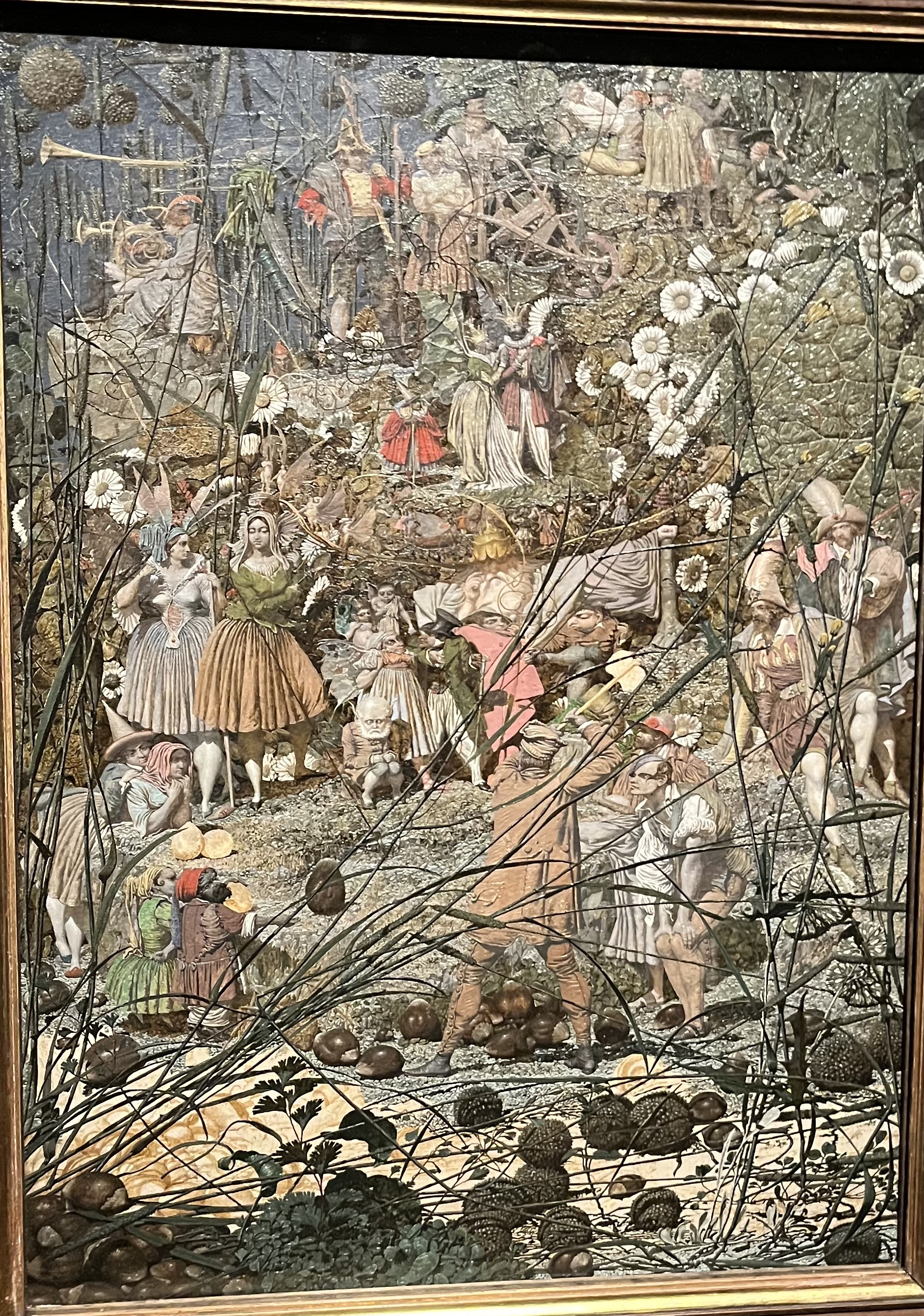
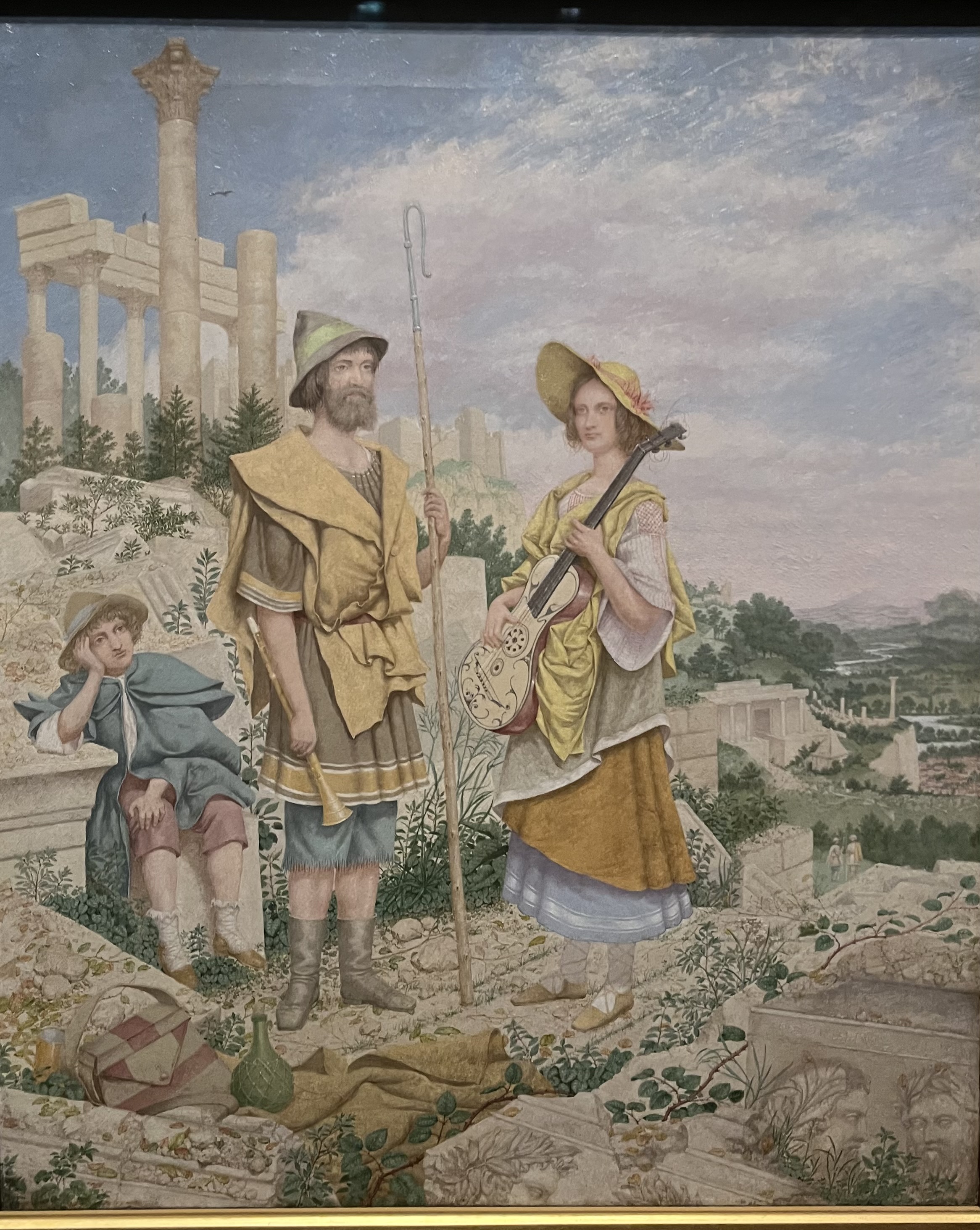
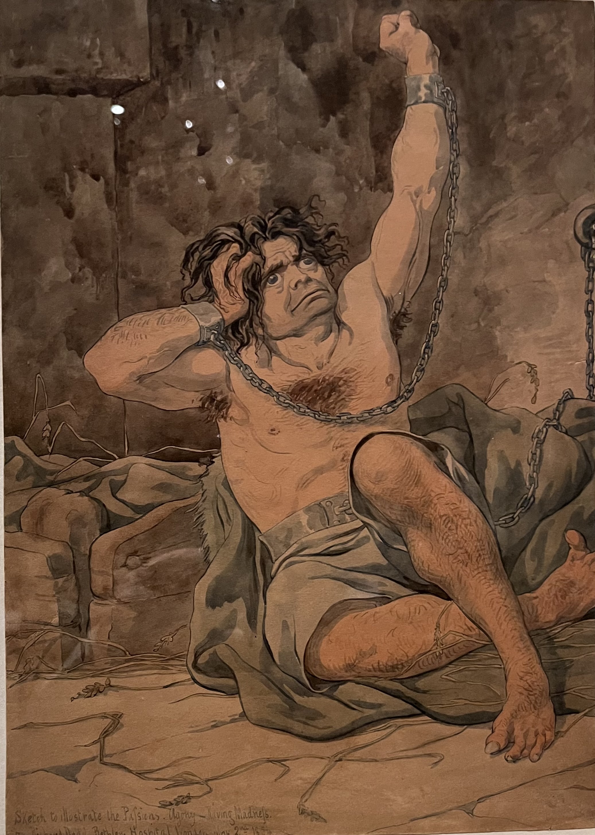
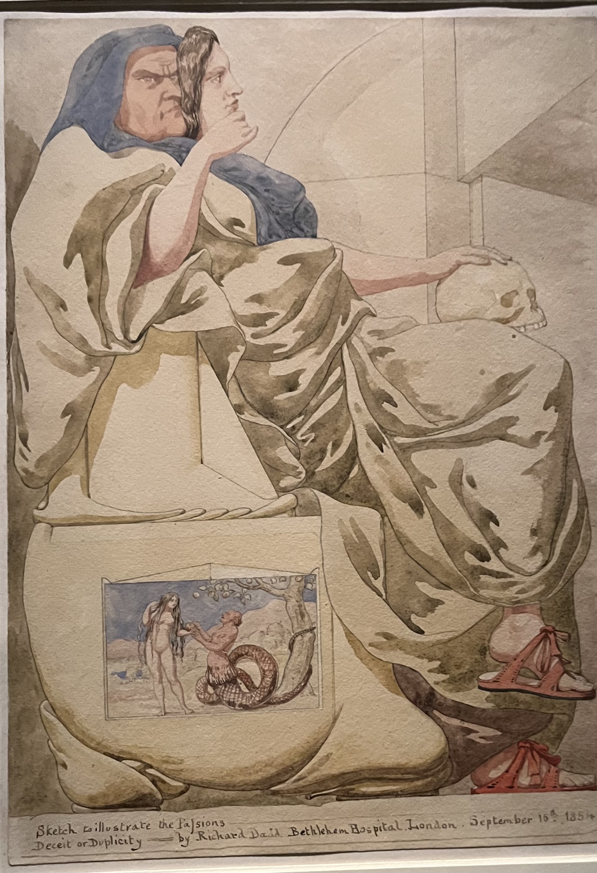
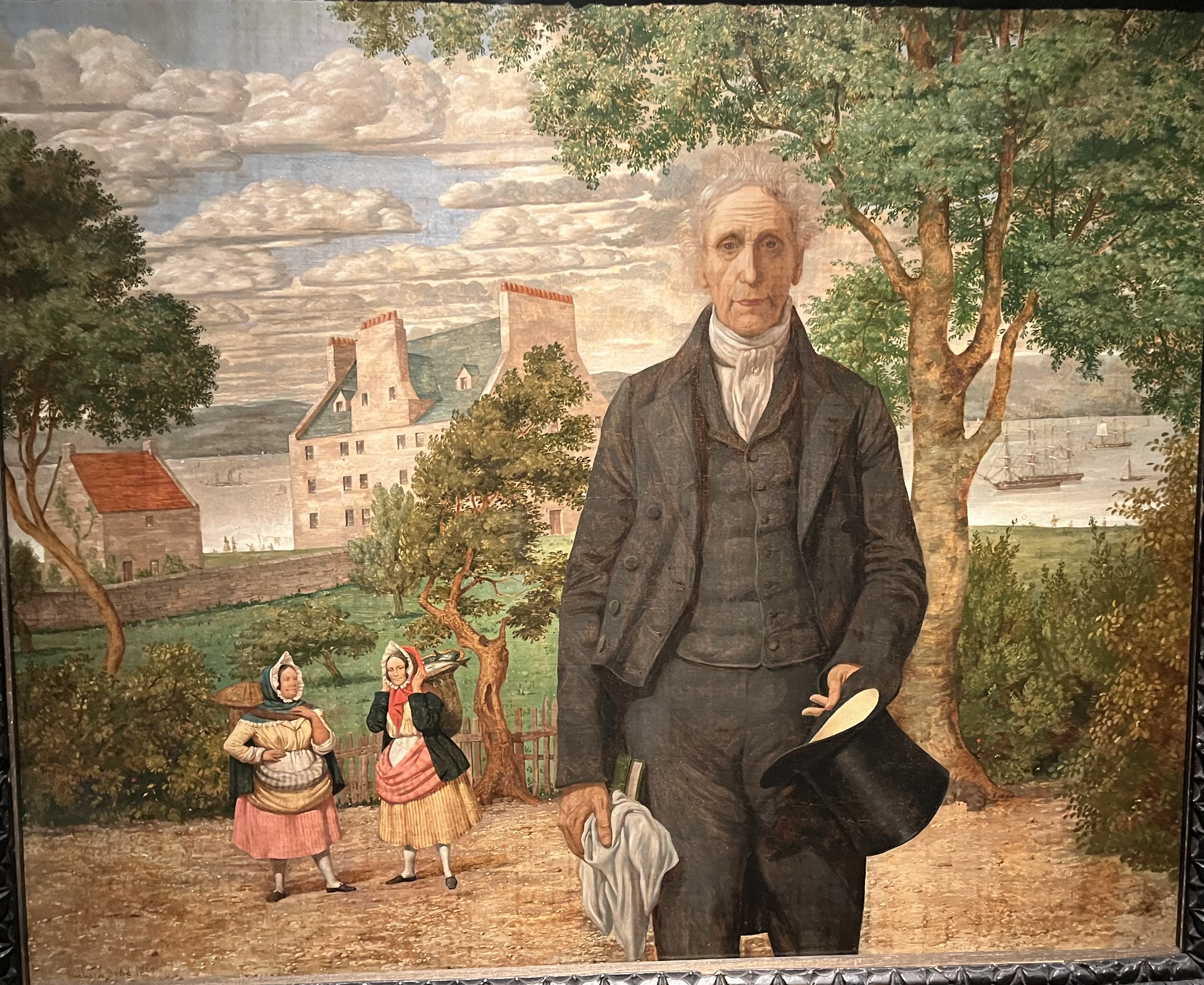
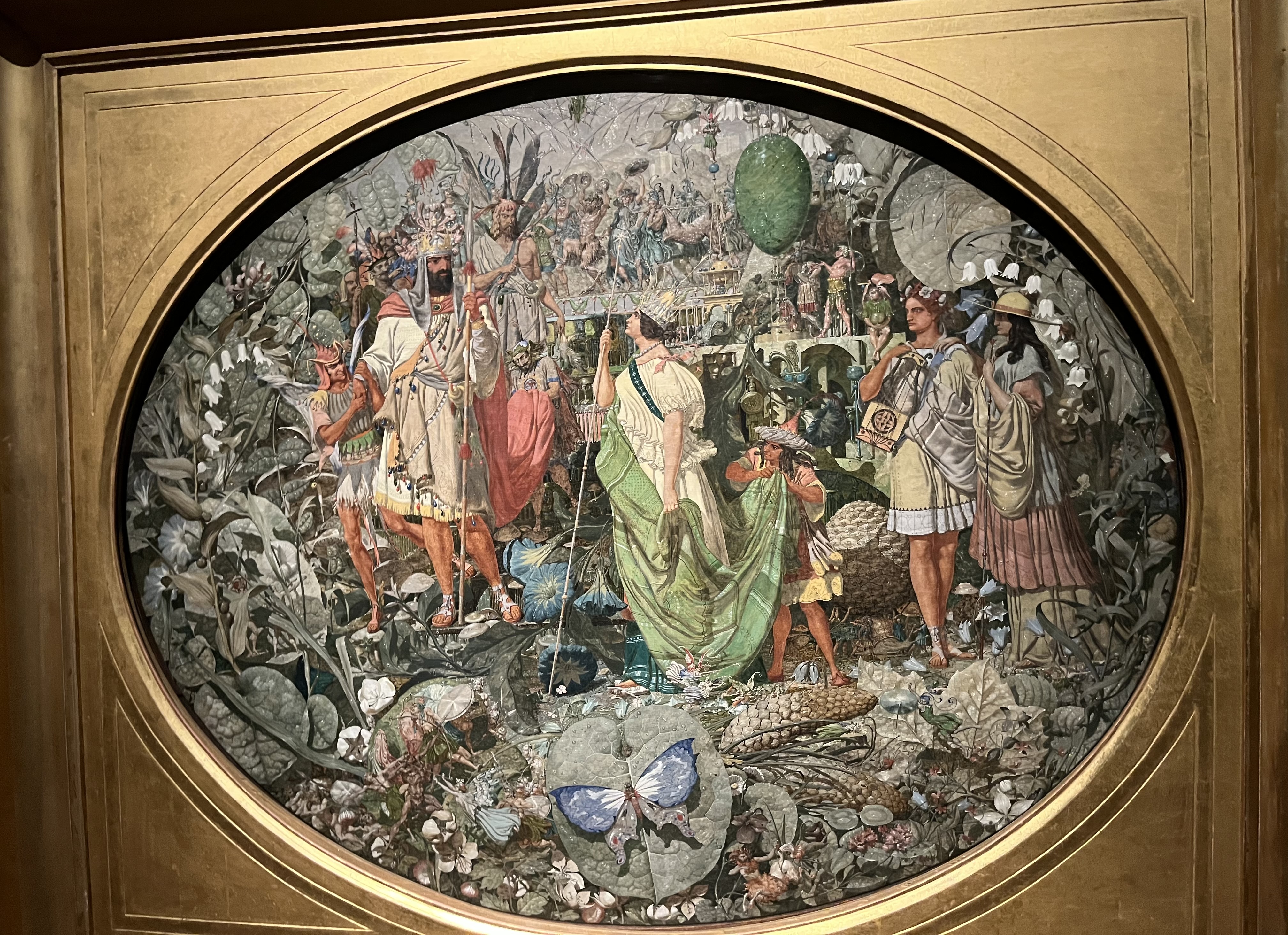
Richard Dadd murdered his father in a psychotic episode and spent the rest of his life locked up in Bedlam and Broadmoor. In spite of the (slightly Blakean?) picture here of a madman in chains, Bedlam had become a more enlightened place by then, and Dadd, already an established artist, was able to continue painting, sometimes doing portraits or commissions for the staff. One of these was to prove by far his most celebrated work, namely The Fairy Feller’s Master-Stroke. Although some of his other paintings are a little strange, this one is in a league of its own, and I don’t think the poem Dadd wrote about it helps explain all that much. He considered the painting unfinished, and you can see that an area at the bottom left is only sketched in.

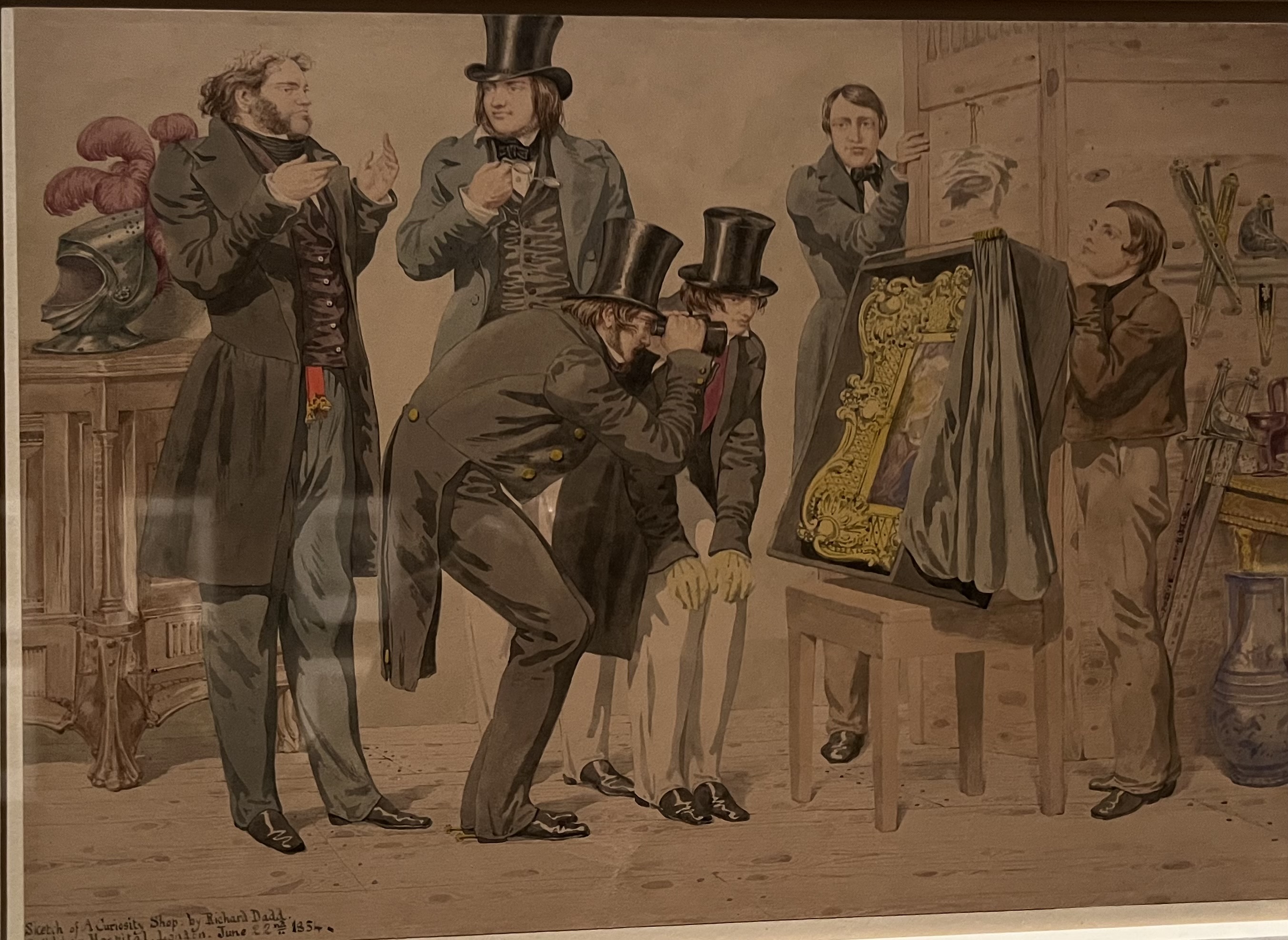
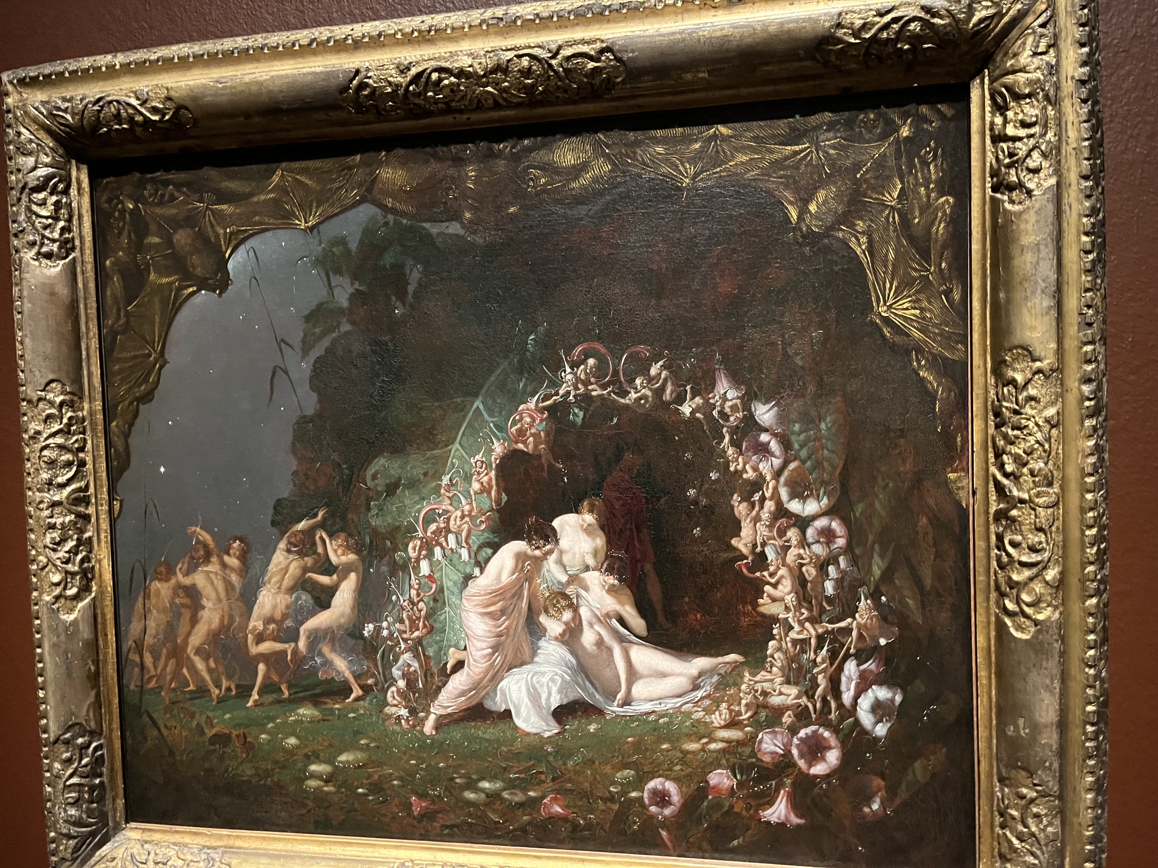
The current exhibition at the Royal Academy shows that Dadd was a real master in terms of technical skill. I don’t think I have ever seen watercolours so crisp, precise and confident. He was known for painting fairies and he liked a bit of Shakespeare, but generally his realism is impeccable and the weirdness in Fairy Feller is much less extreme in other works. Most of them are interesting but Fairy Feller is the one you could spend all day looking at.

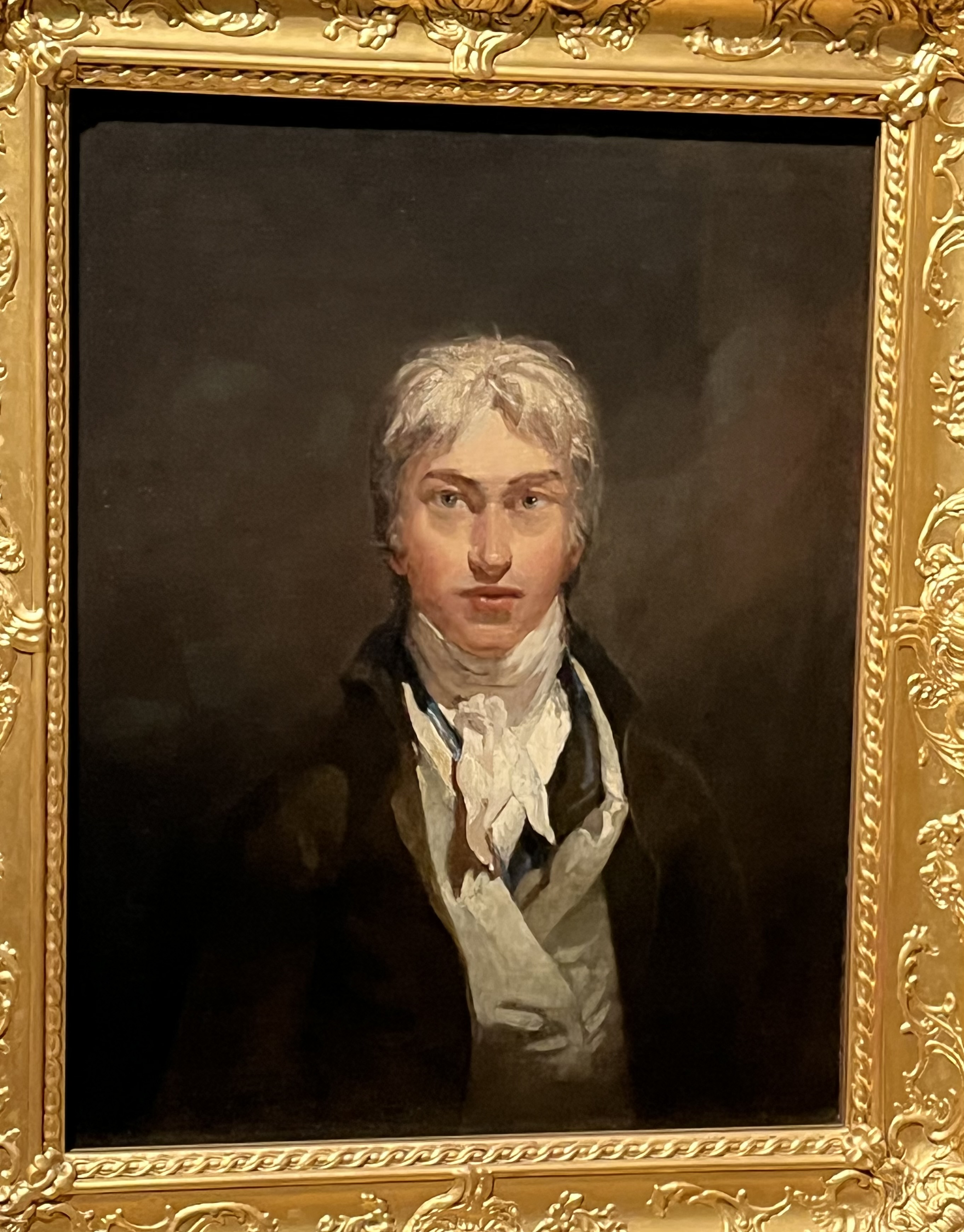
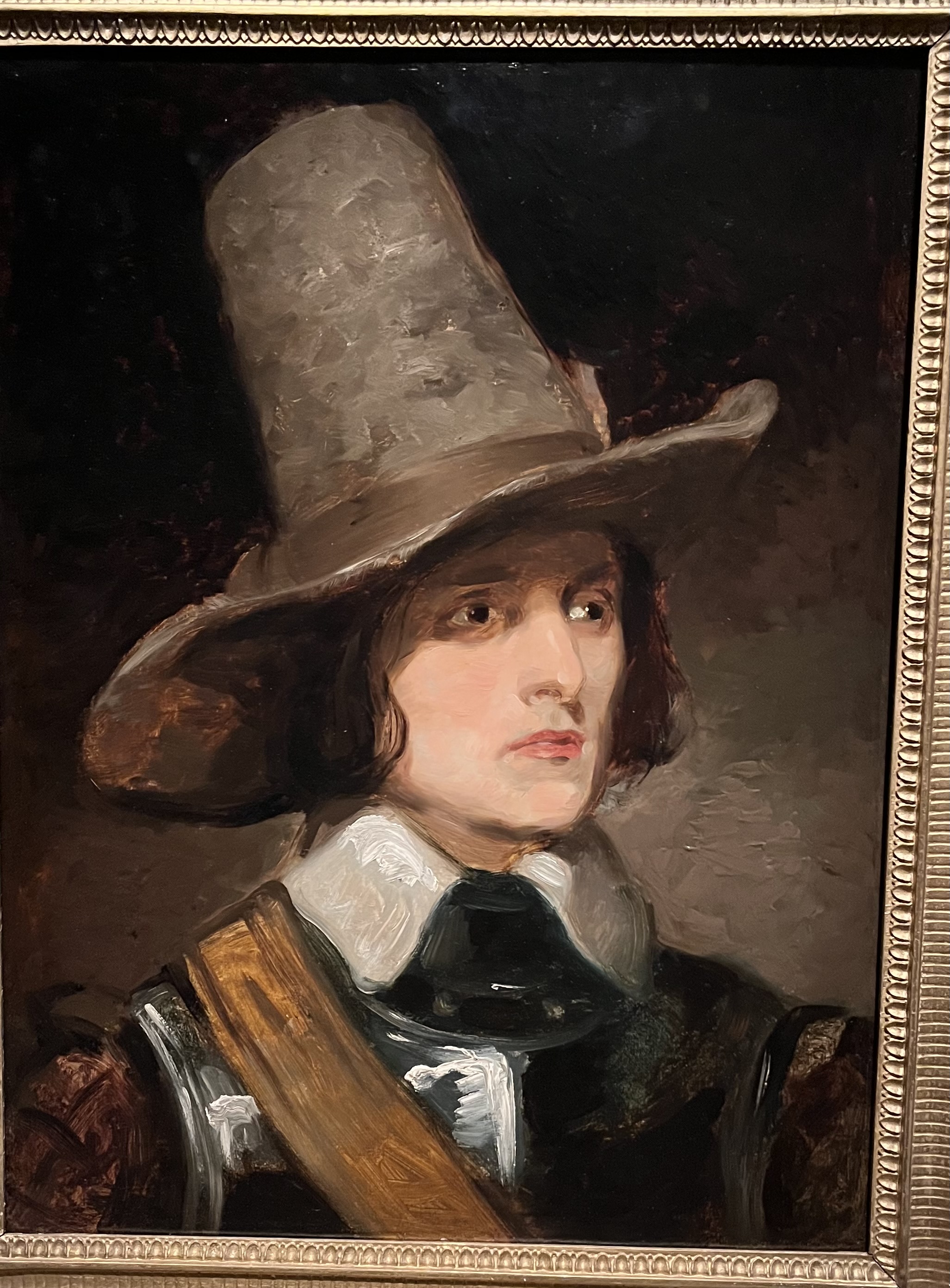
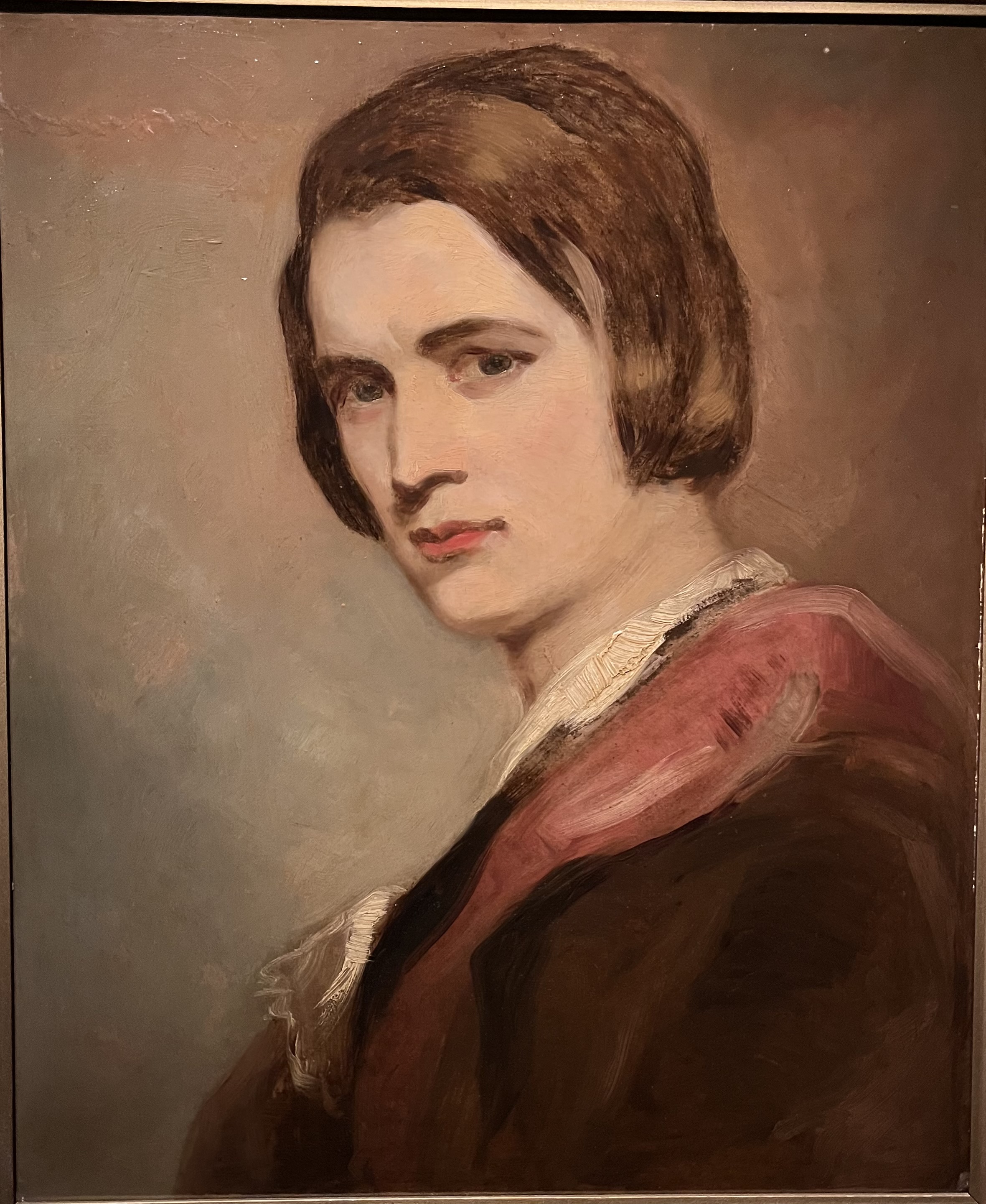
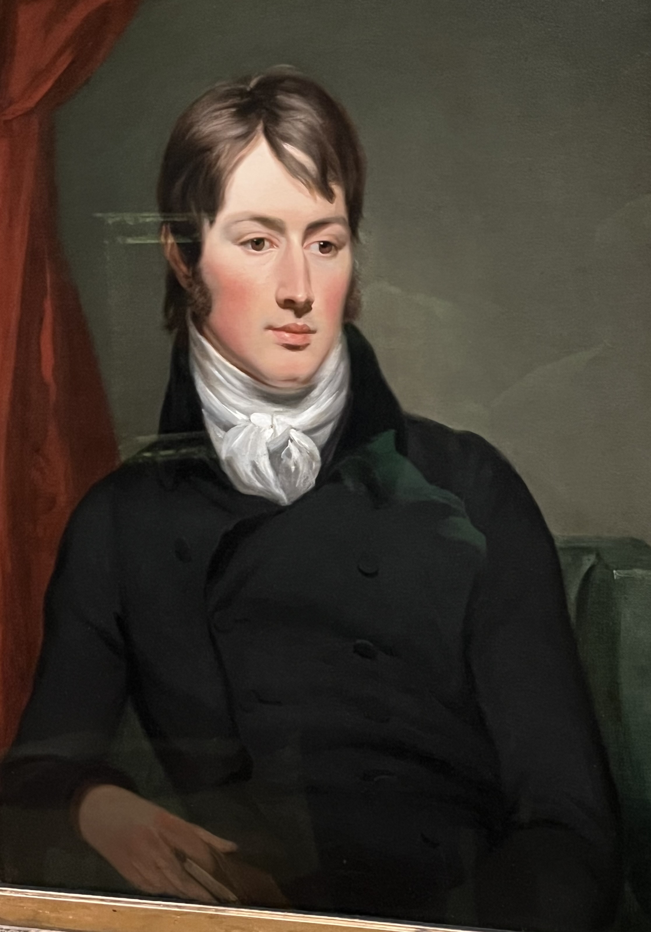
(The chap in the big hat is another artist and friend of Dadd’s who rejoiced in the name of Augustus Leopold Egg. The fellow in the adjacent picture with the strange longish hairstyle is a self-portrait of Dadd.)
Turner and Constable

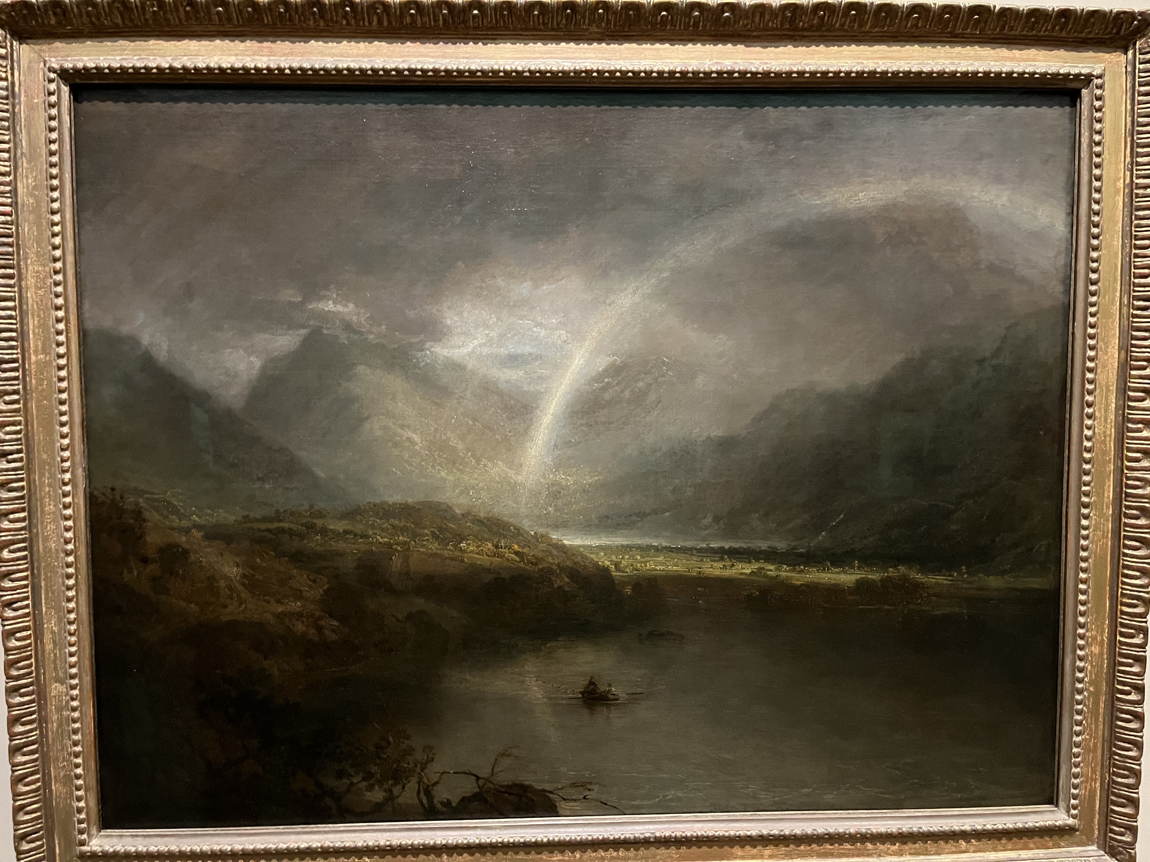
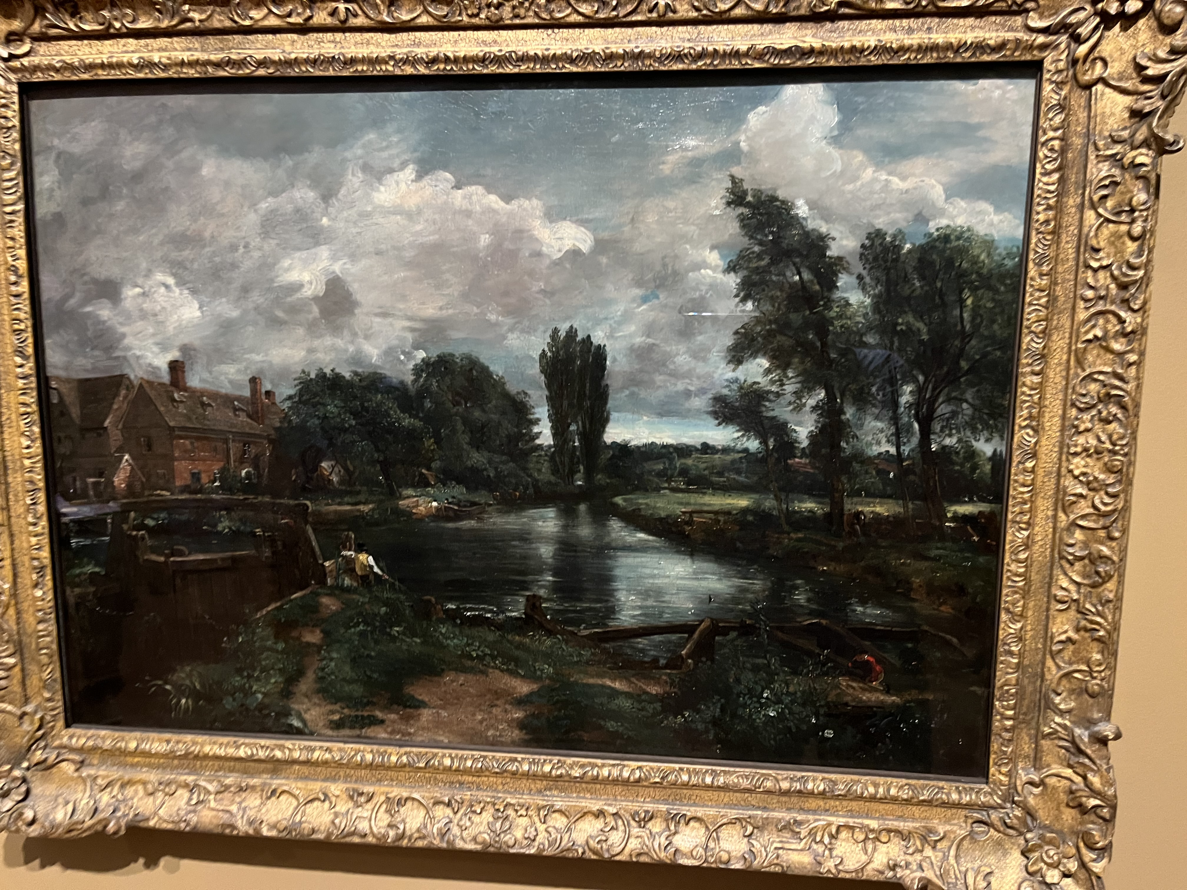
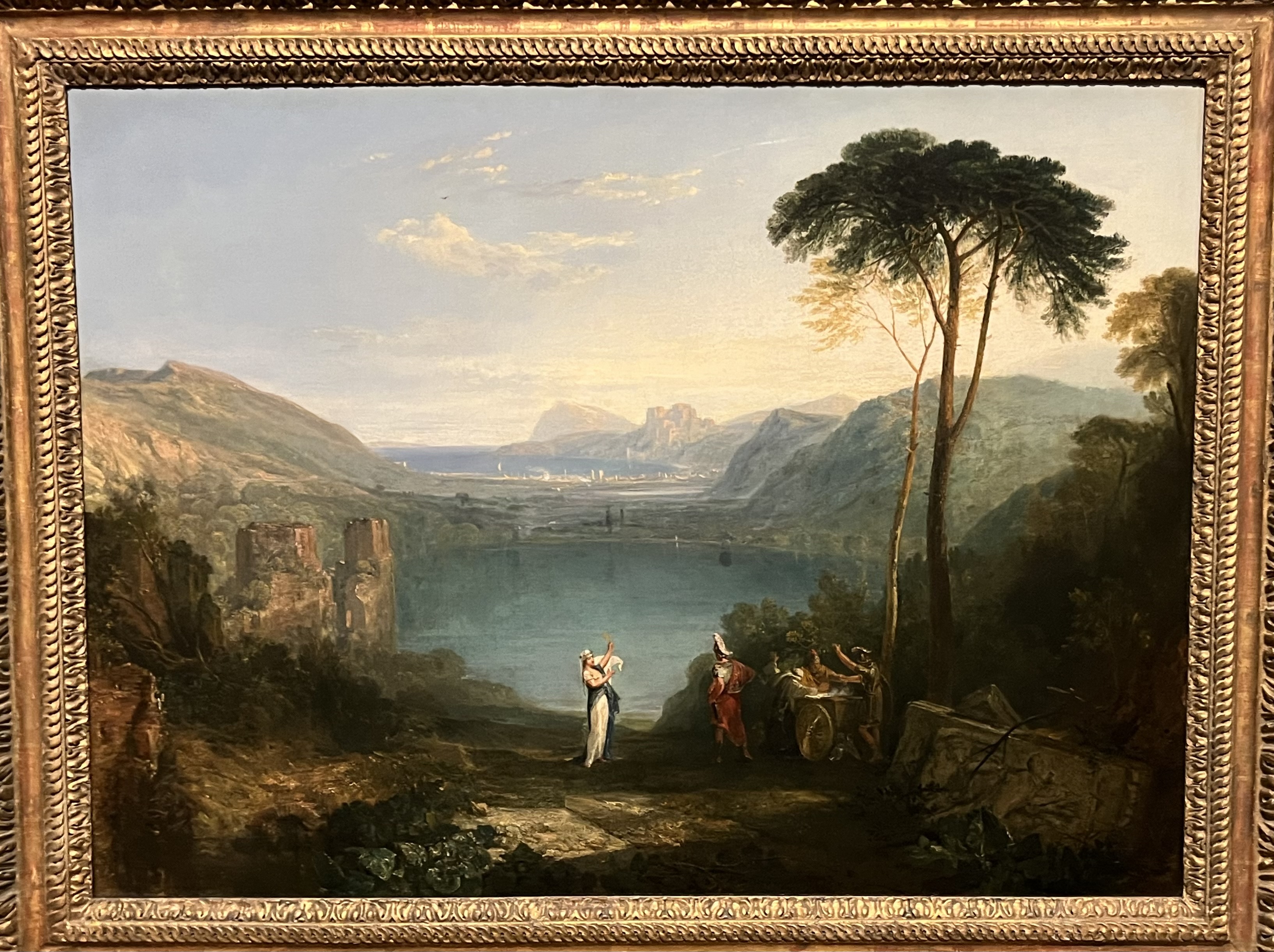
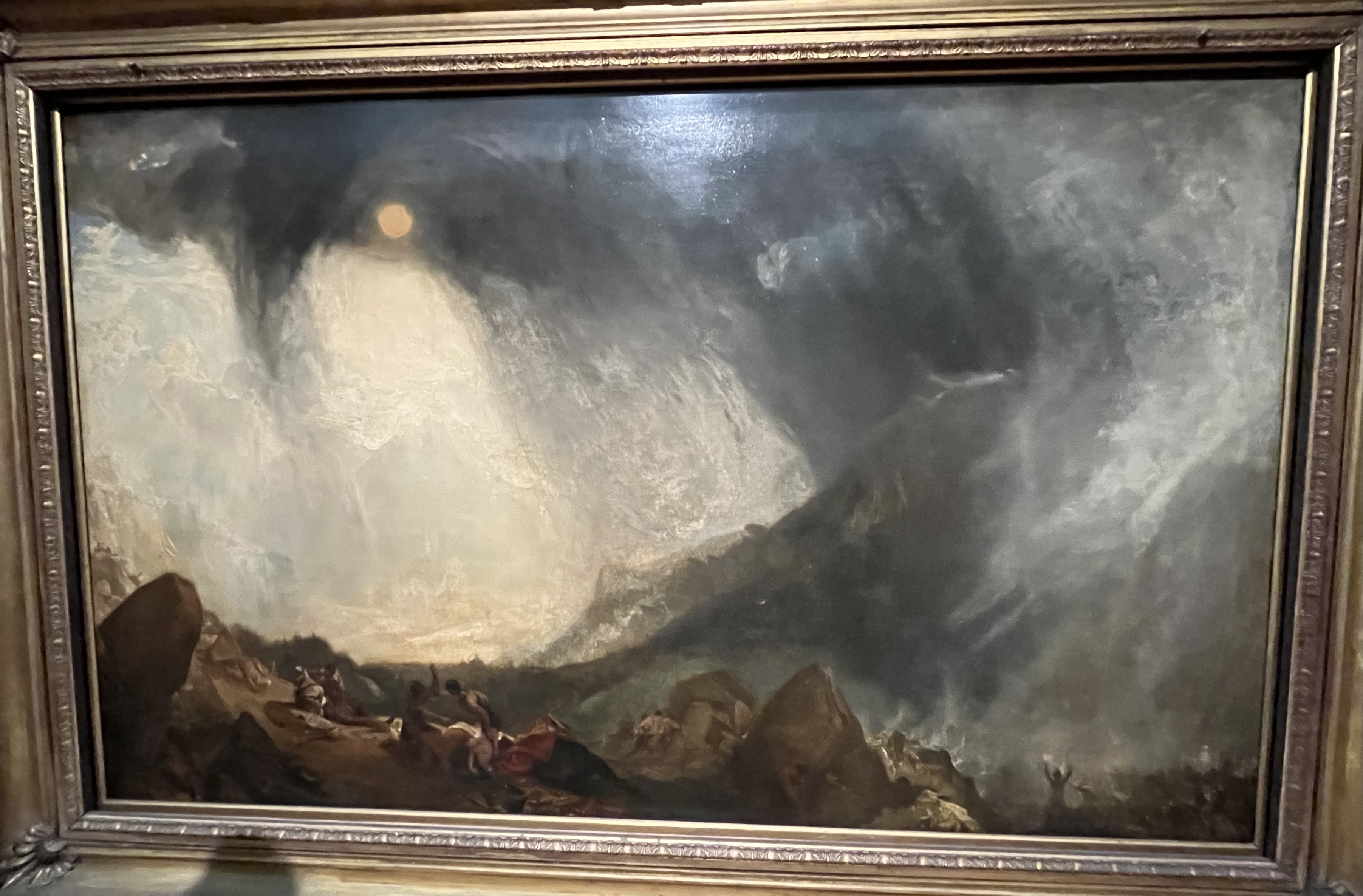
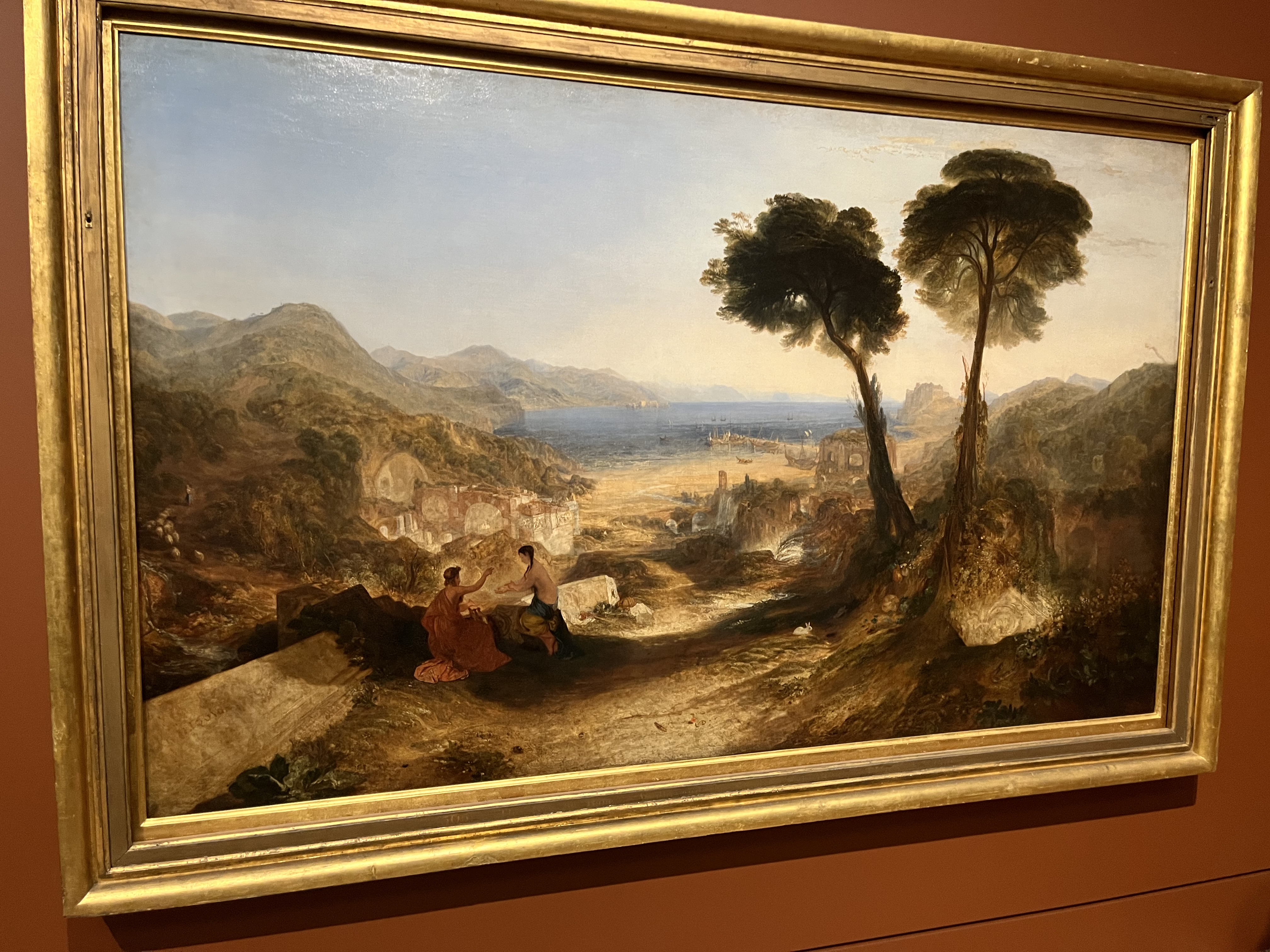
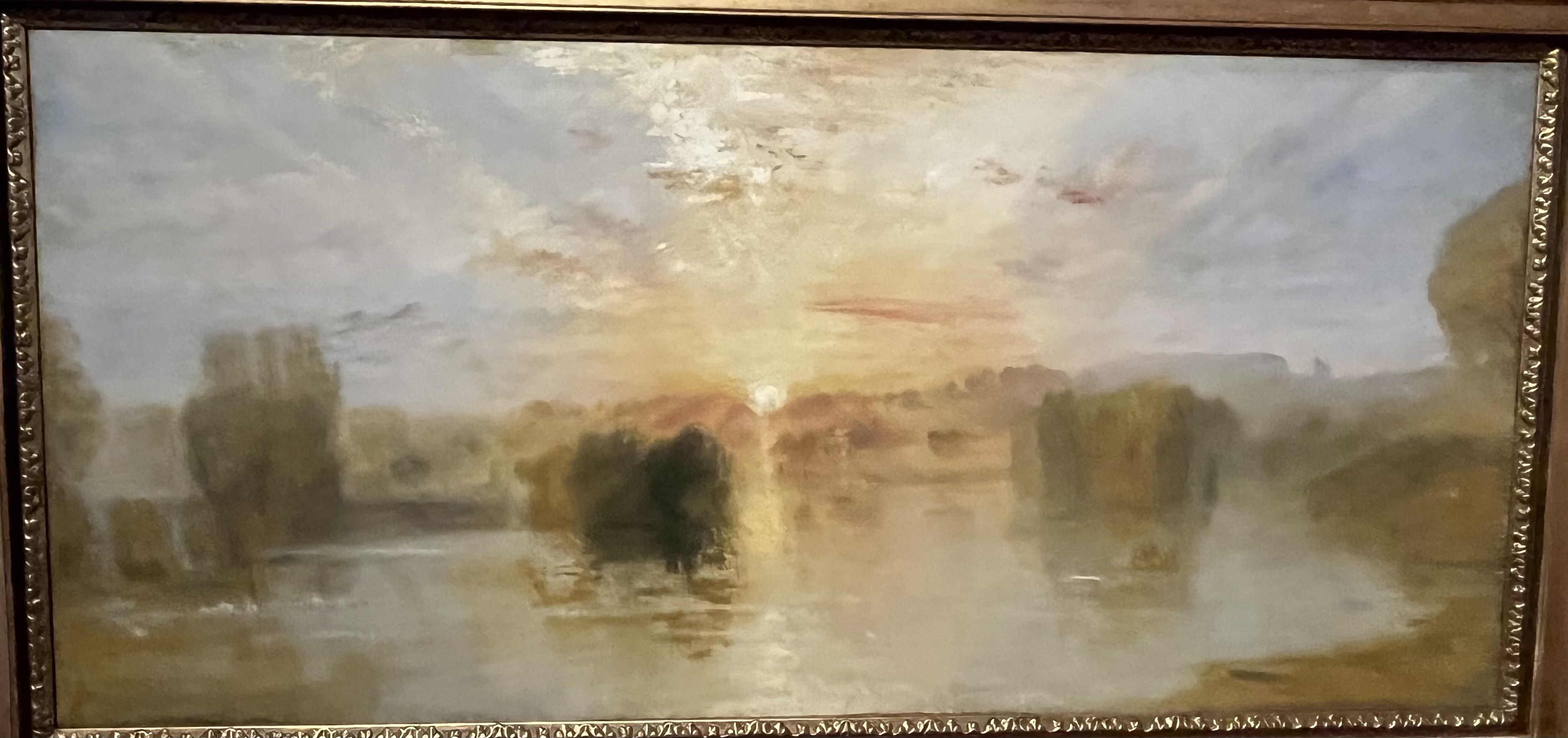
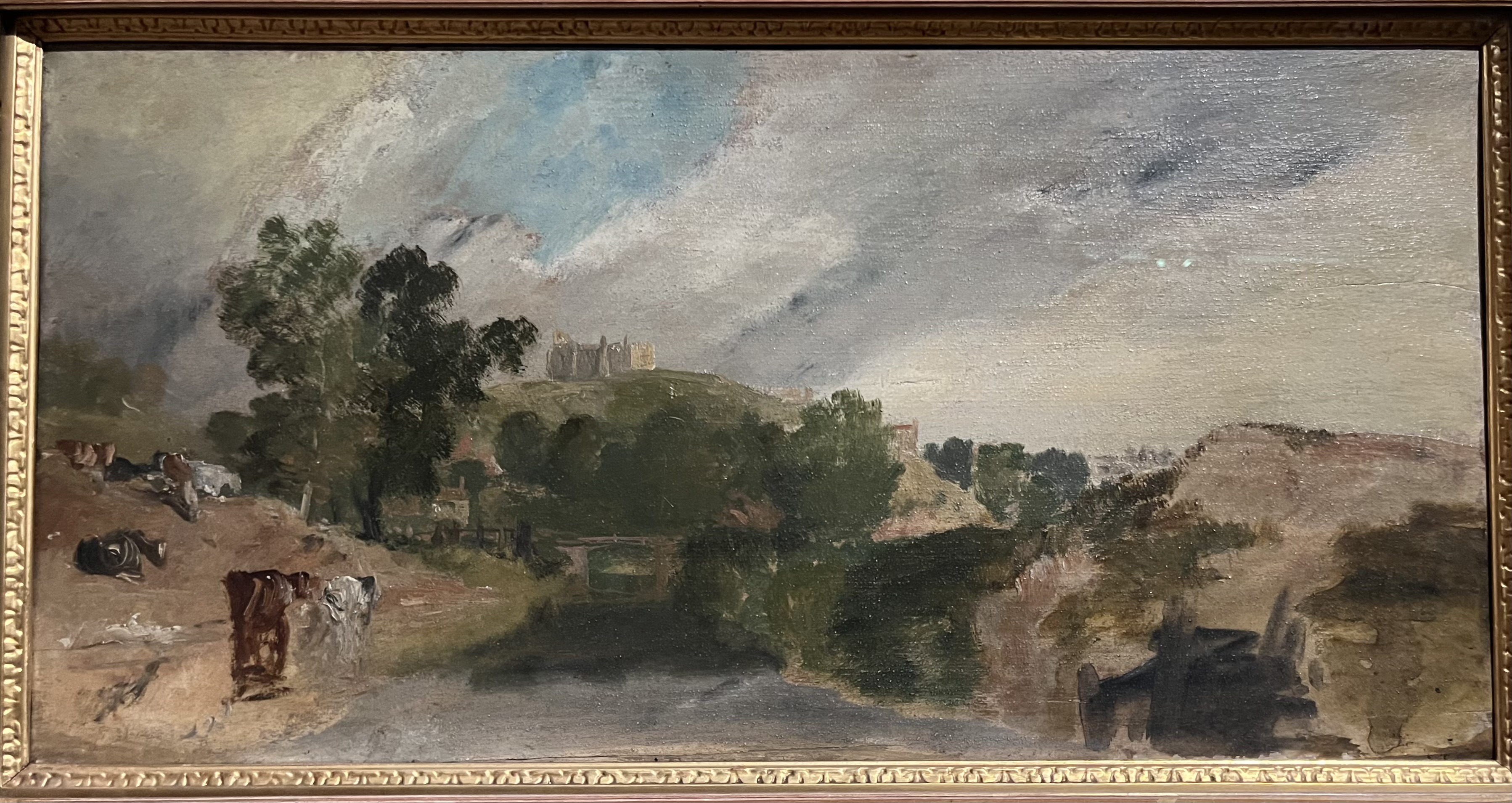
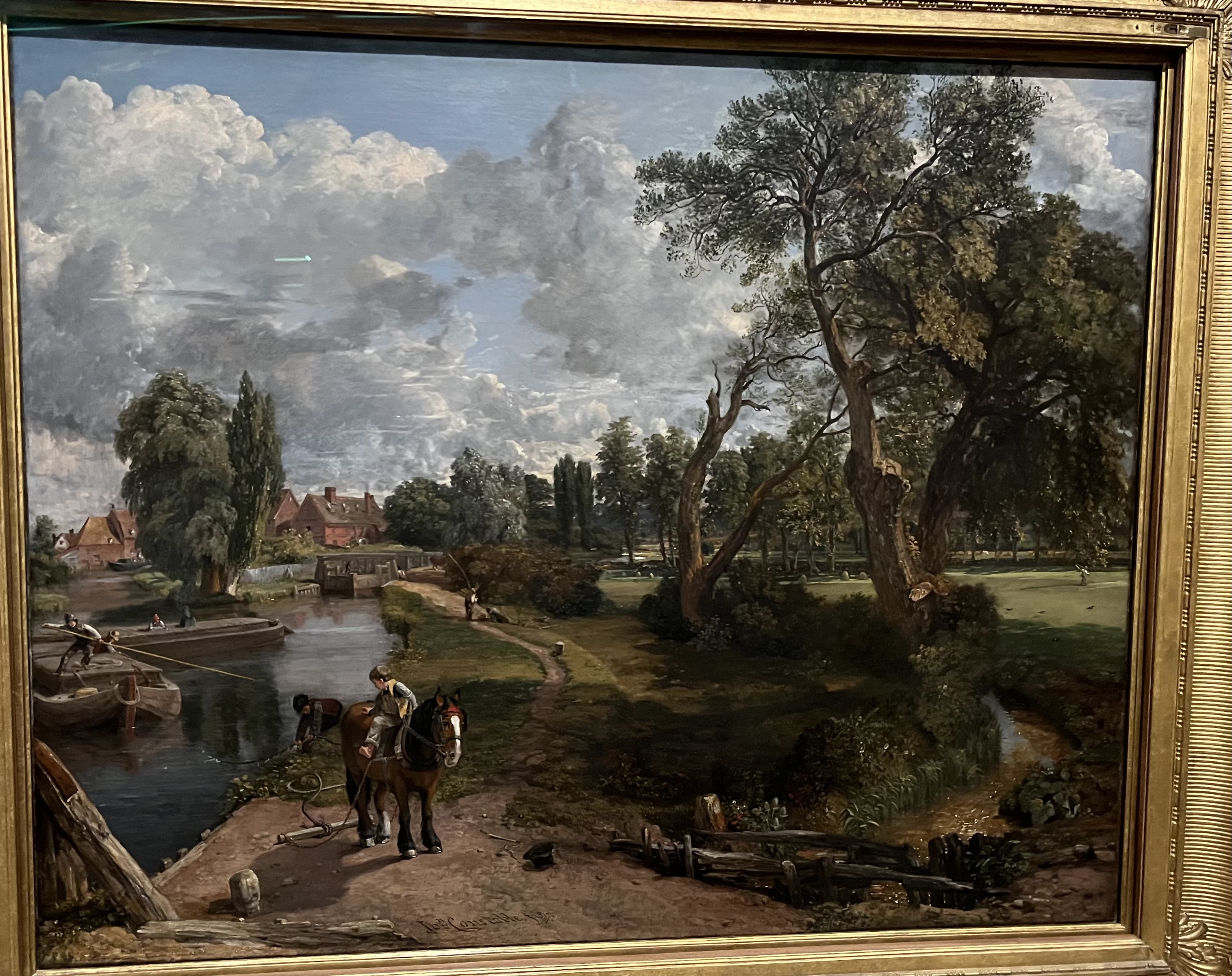
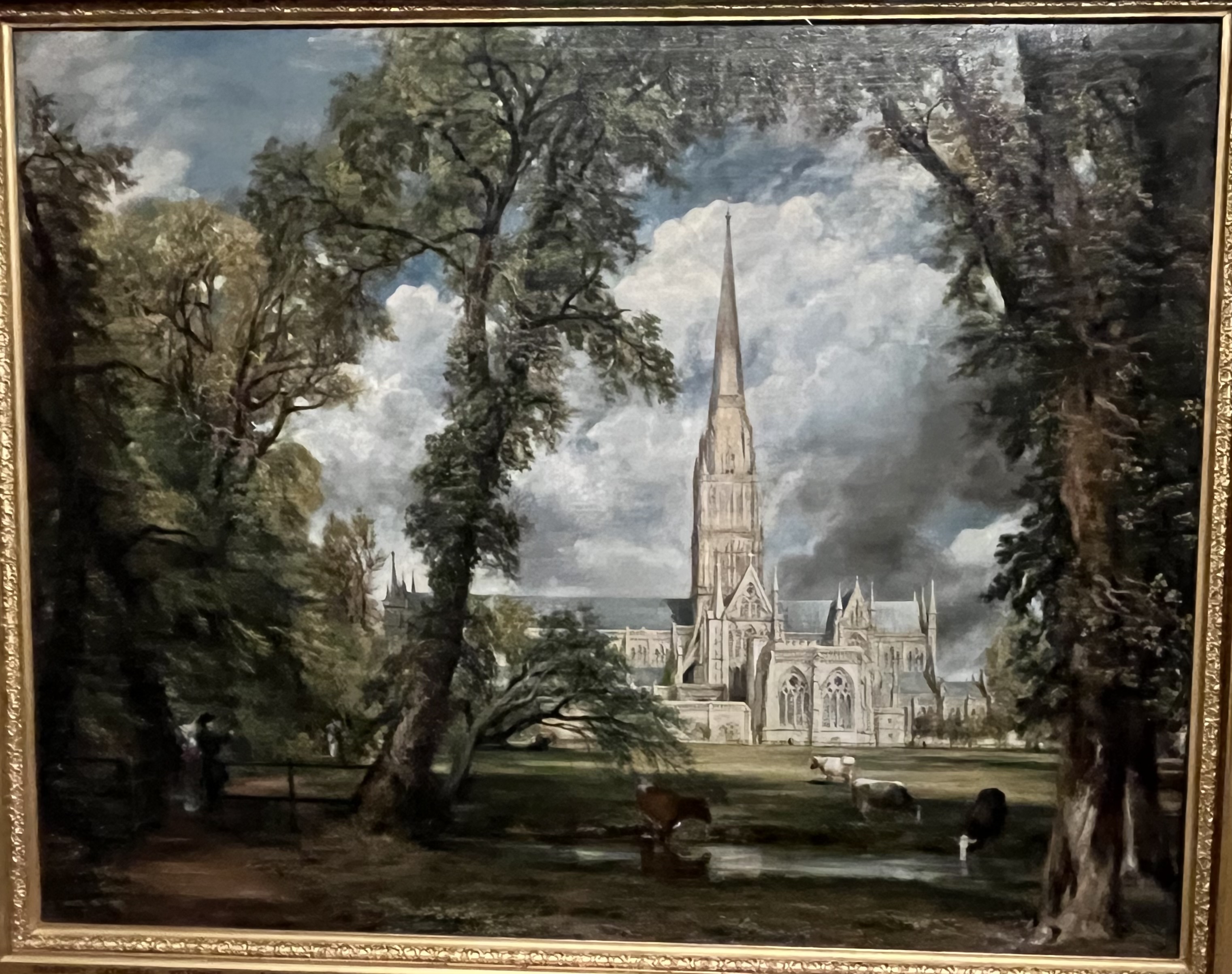
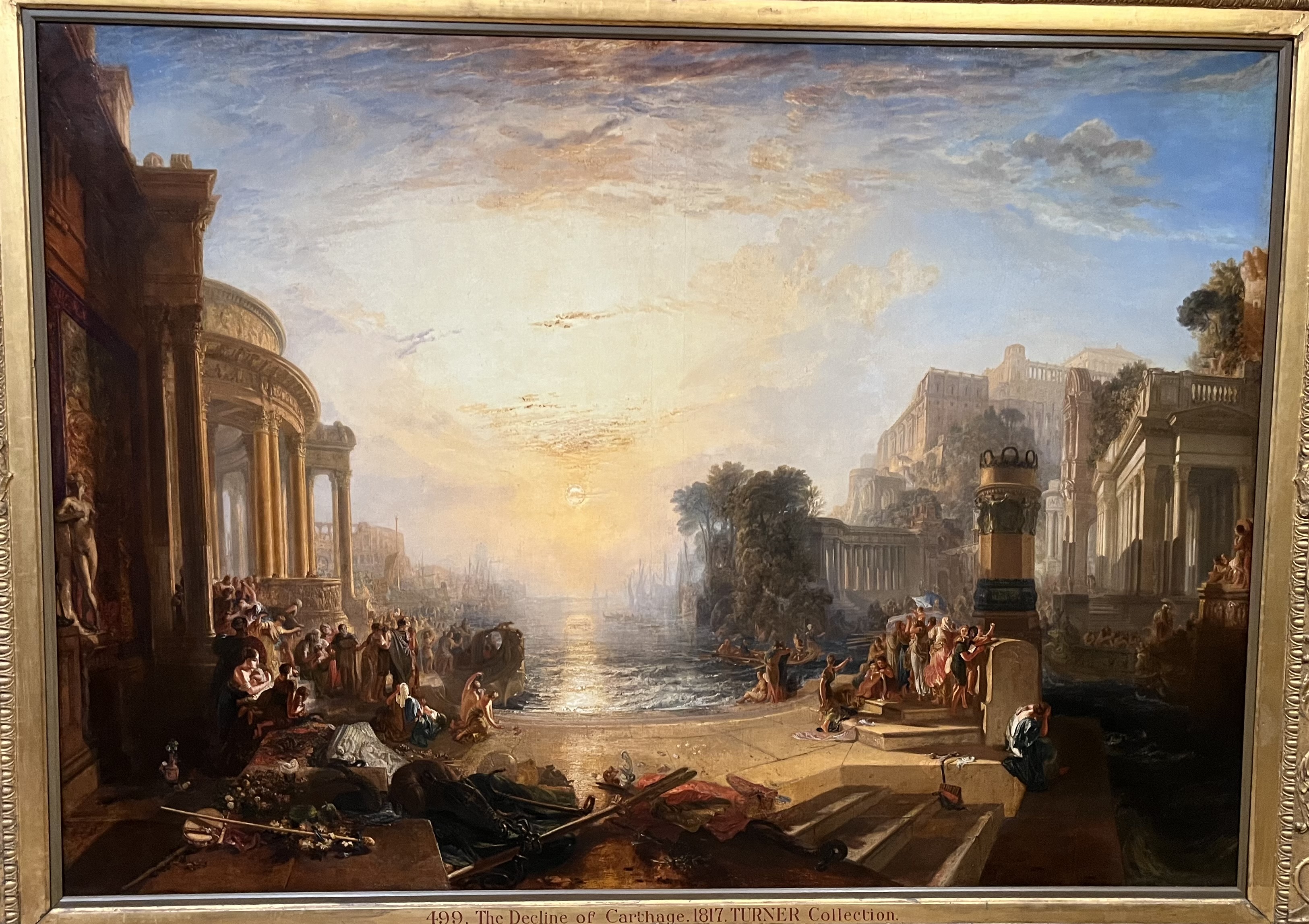
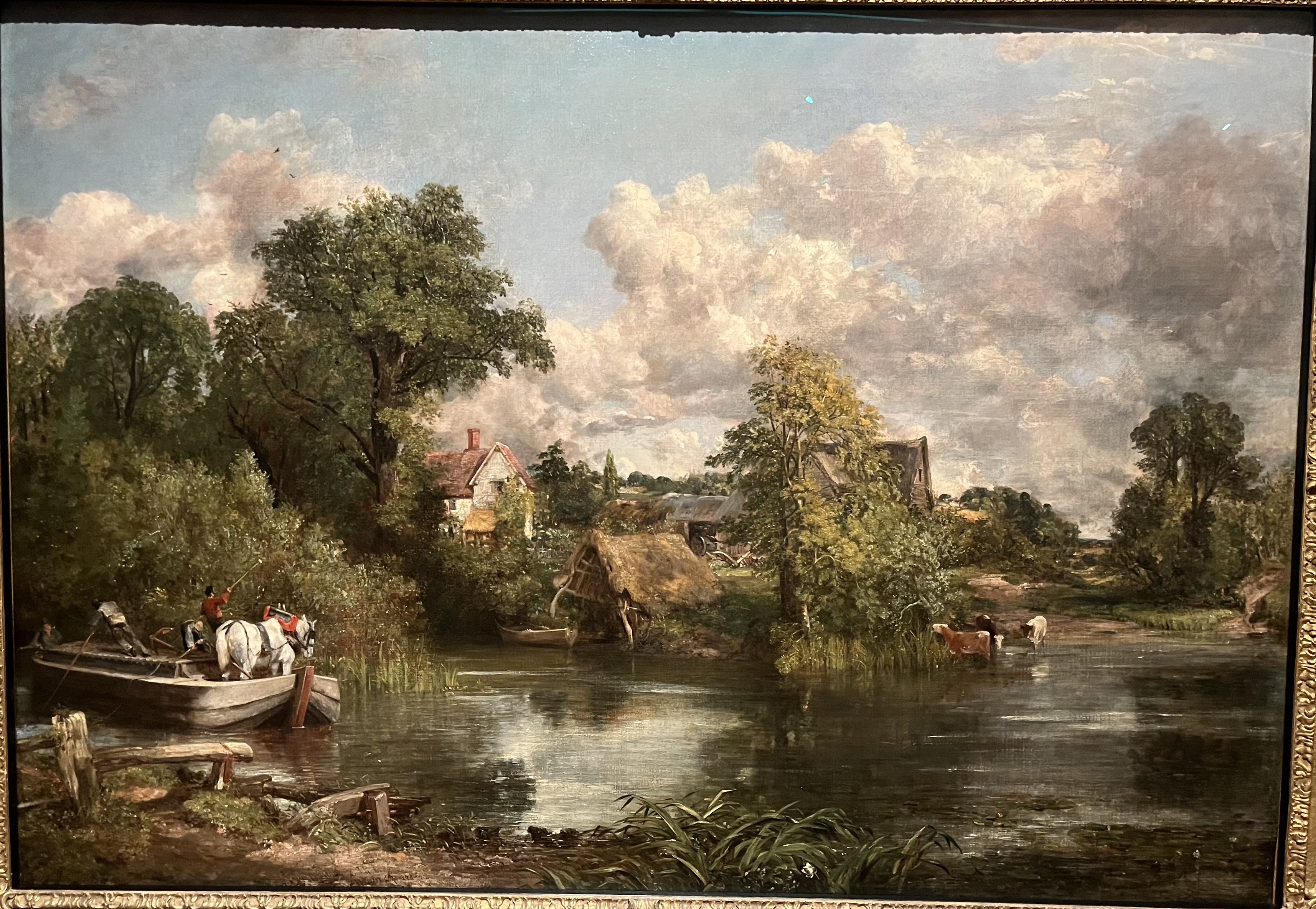
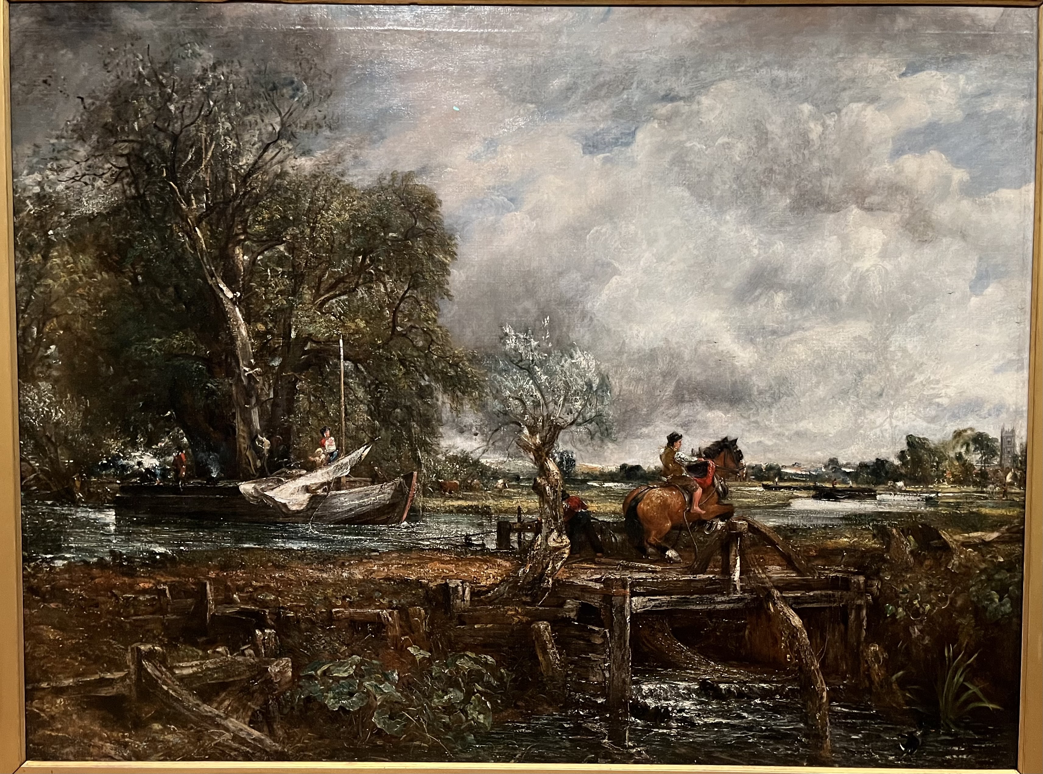
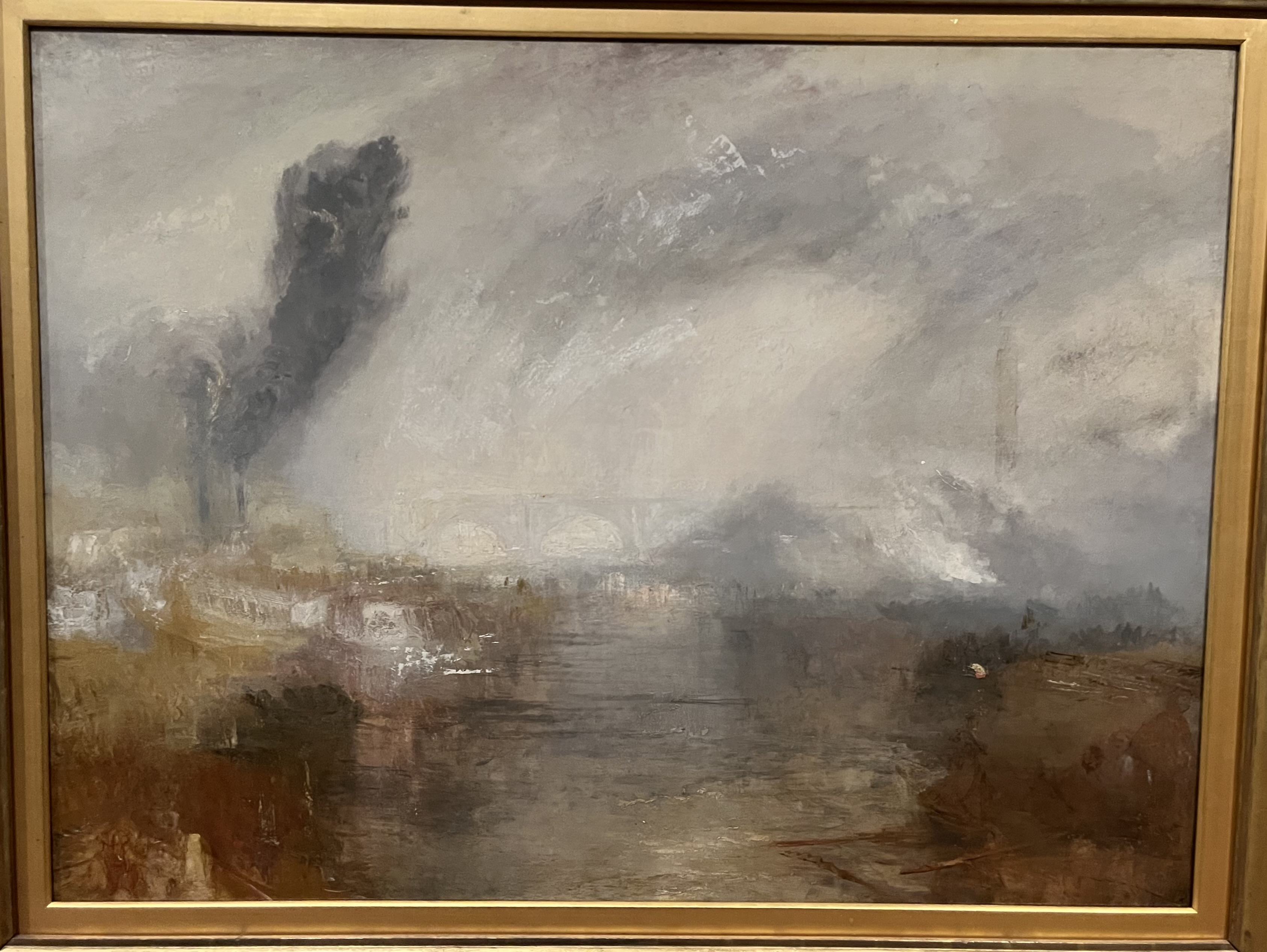
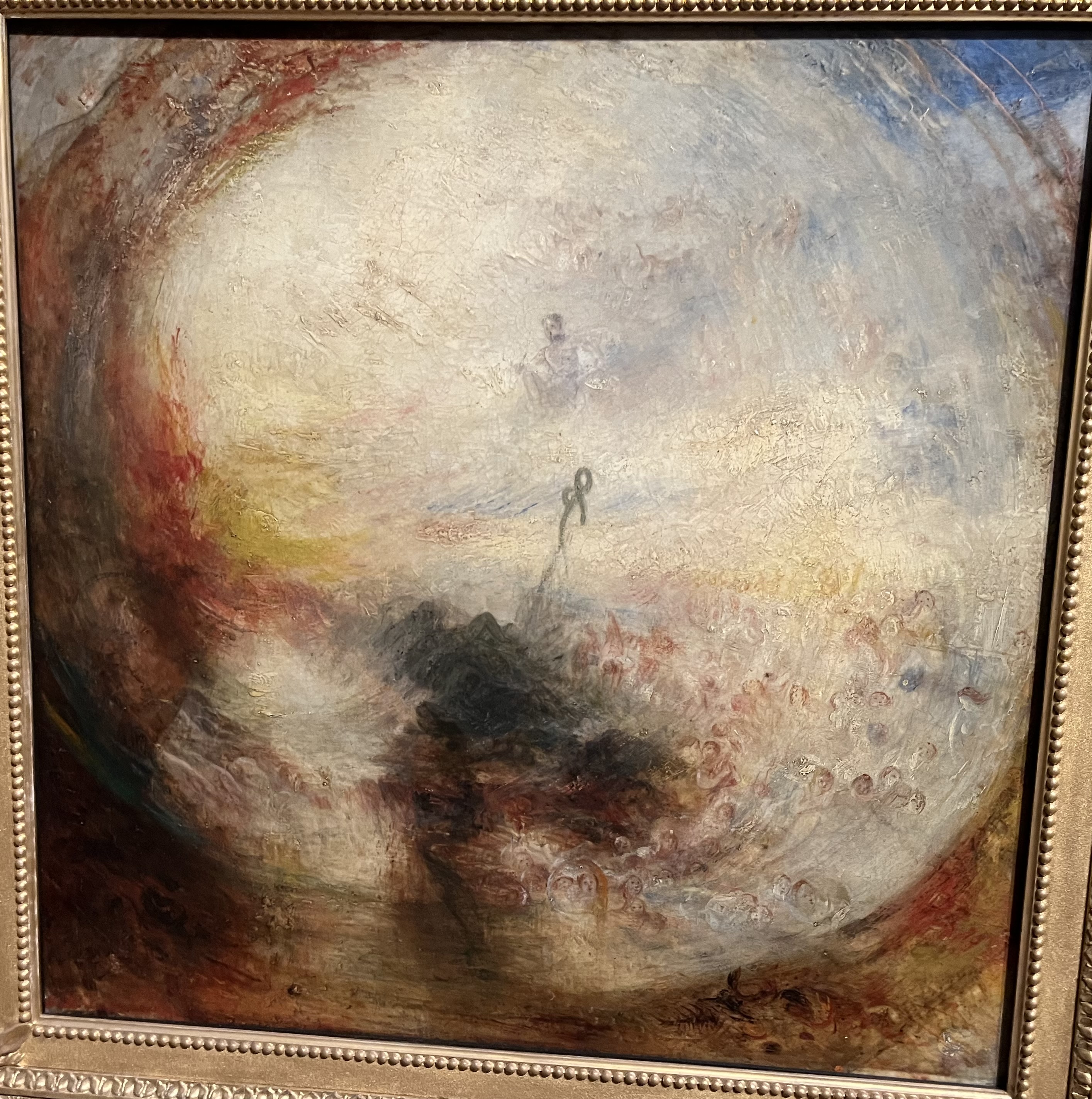
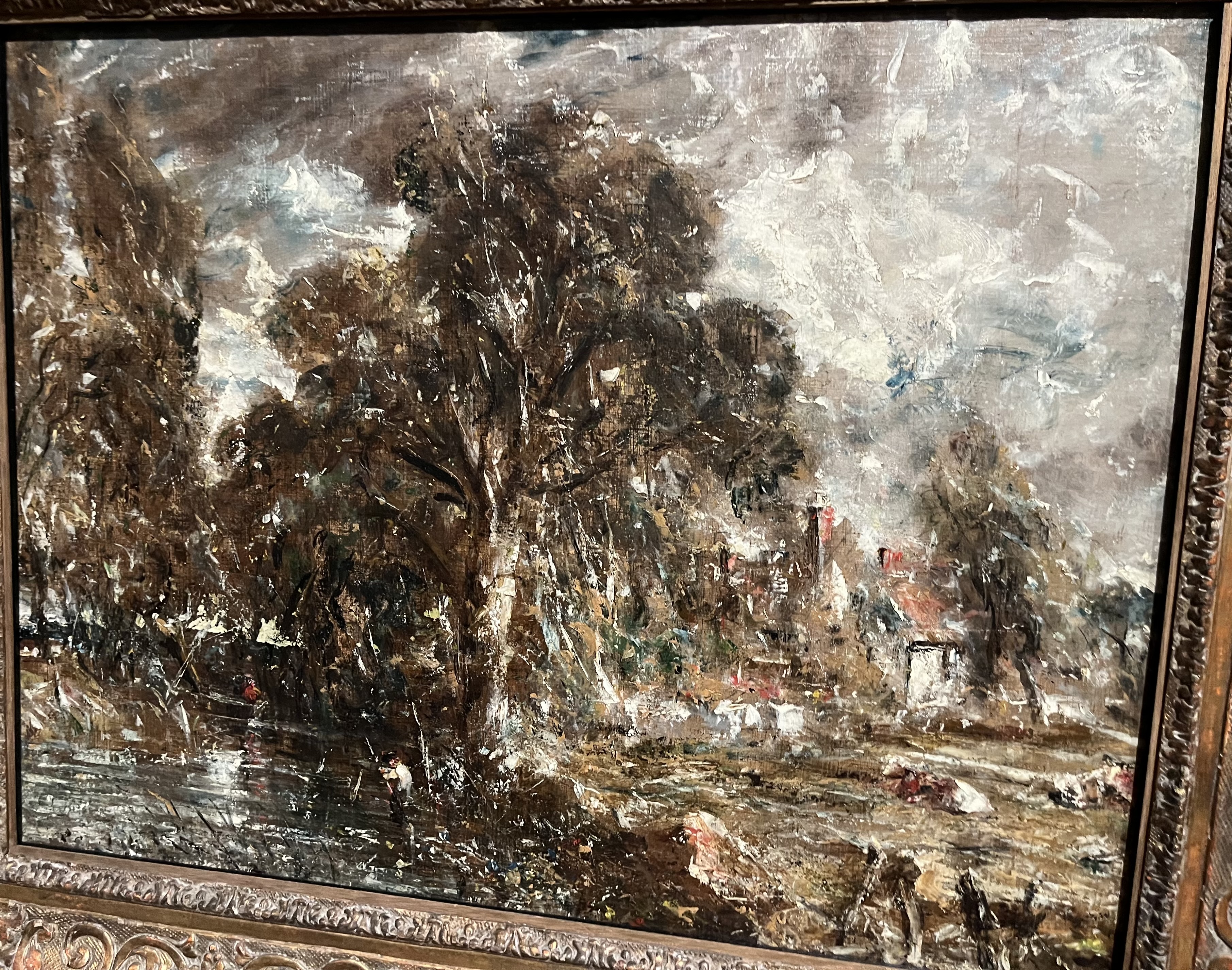
This show at Tate Britain has a fantastic collection of works by both artists (but no Haywain, no Fighting Temeraire). There was a rivalry between the two, who were almost exactly the same age: sometimes friendly, sometimes with an edge. Turner was more radical and achieved recognition much earlier. He travelled more, and was more adventurous both in his range of subjects and in his techniques. Occasionally his love of drama led him to produce paintings that are slightly absurd or virtually incomprehensible (Moses writing Genesis in a weird foggy bubble). Constable’s rural scenes are much safer, but there is an insistence on the real that perhaps veils a hint of darkness. Constable preferred to paint direct from life until he realised that ‘six-footers’, which could only be painted in the studio, were what got him attention.

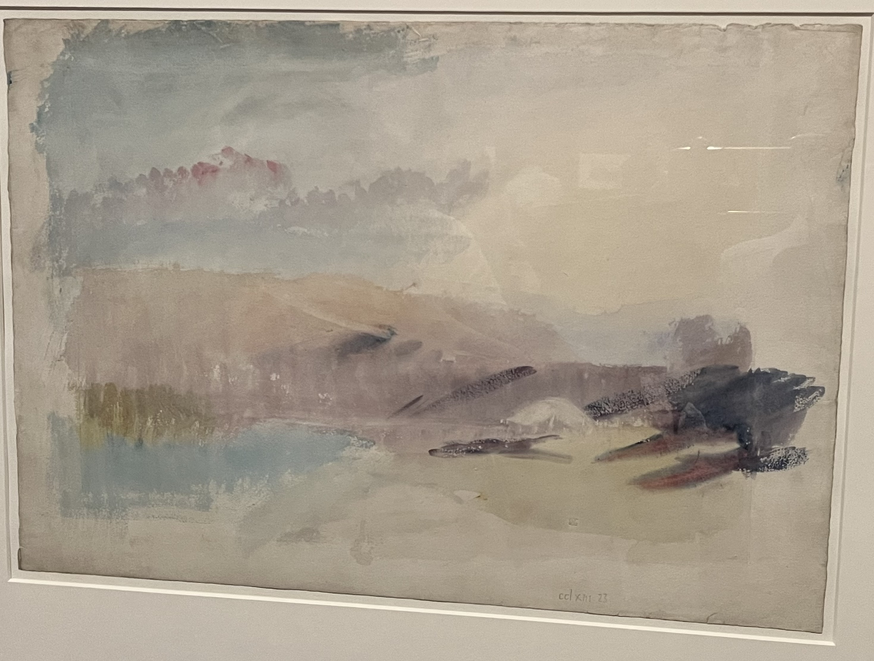
Turner is often mentioned as a precursor of Impressionism, but here we can see that Constable was also given to a free, loose style, especially later on in his career. When the Pre-Raphaelites came along, all of that was dumped: though they respected the older painters’ attention to Nature, they rejected ‘sloshy’ painting in favour of sharp edges and a realism filled with clear detail. I like the Pre-Raphaelites, but this exhibition makes it seem they took British art down a dead end, diverting it away from what might have been a British school of Impressionism and some memorable art.

Shed Painting

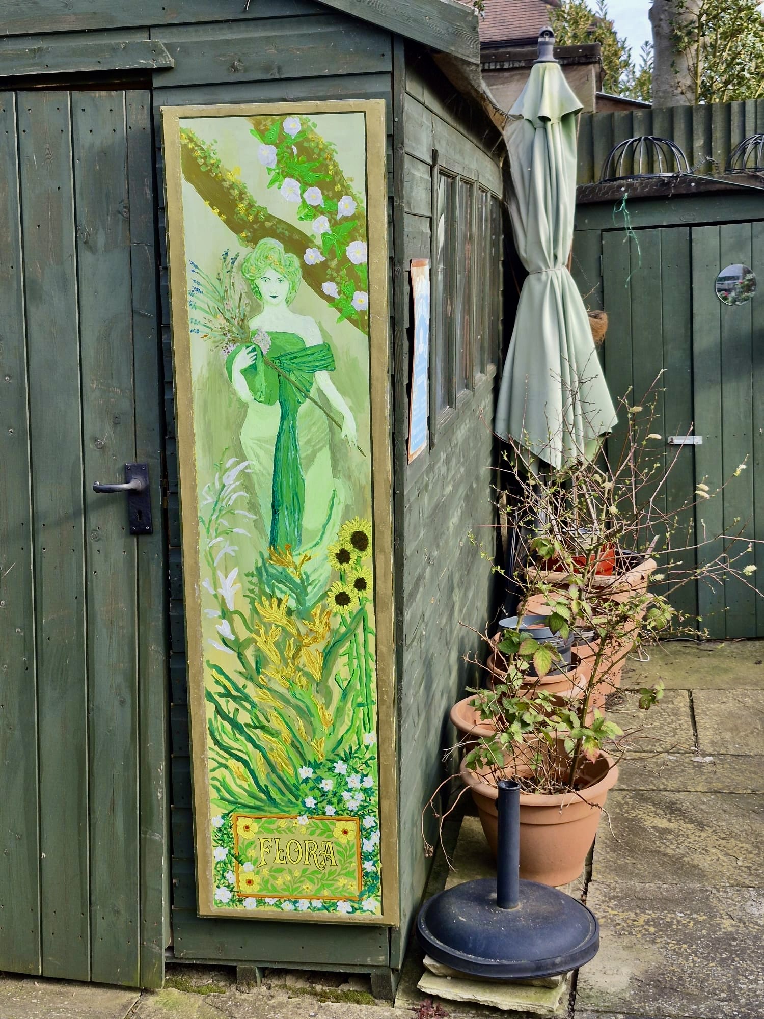
I did a painting for the garden shed. This is acrylics on a hardboard panel that was once half the back of a wardrobe (I glued wooden battens to the back for rigidity). The gold frame is done with a gilding paste, and I gave the whole thing a couple of coats of yacht varnish to protect it from the rain.

The figure of Flora is based on one of Mucha’s ladies, but it completely lacks the sharp precision and firm outlines that you find in his stuff.

Francis Bacon: Human Presence

We went to the current exhibition at the National Portrait Gallery. People sometimes see a problem with the NPG’s remit – are they meant to collect paintings by famous artists or of famous people? But this show is unimpeachable, foregrounding an important aspect of a major artist’s work.

Bacon’s work never stopped being figurative, but he smooshes views in a way that combines and gives a sense of observer motion. It seems he often put one person’s head on a body painted from photographs of someone else. There’s also often a sense of horror, with the screaming heads and internal body parts.

The exhibition tellingly brings out his enthusiasm for certain great painters of the past: Velasquez, Rembrandt, Van Gogh, which helps situate an innovative painter within the great tradition.

Tiles and Flowers

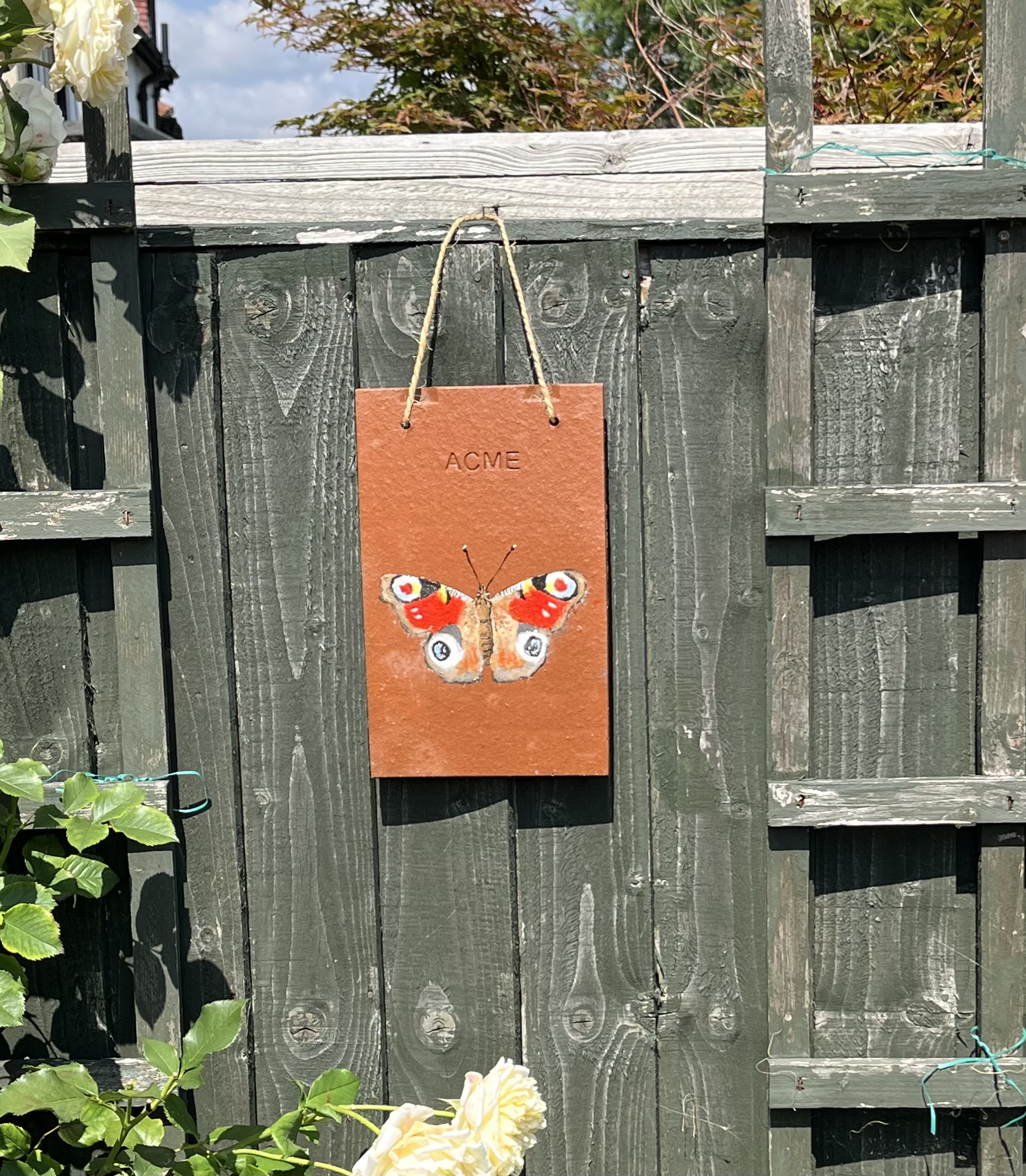
We had some roof tiles (Acme brand, of course, suitable for dropping on the head of Wile E Coyote) left over from our recent building project. I thought I might try painting some with the kind of flower design that is the traditional decoration for narrow boats.
I drew out the design, traced it onto the tile, and filled in with gesso to provide a decent surface to paint on. Once painted I used a stencil to spray varnish on the painted area. It all worked OK, but I think the fact that I was copying meant I didn’t quite get the free, stylised look, and the colours are a bit light. Still, I quite like them!

Pippi

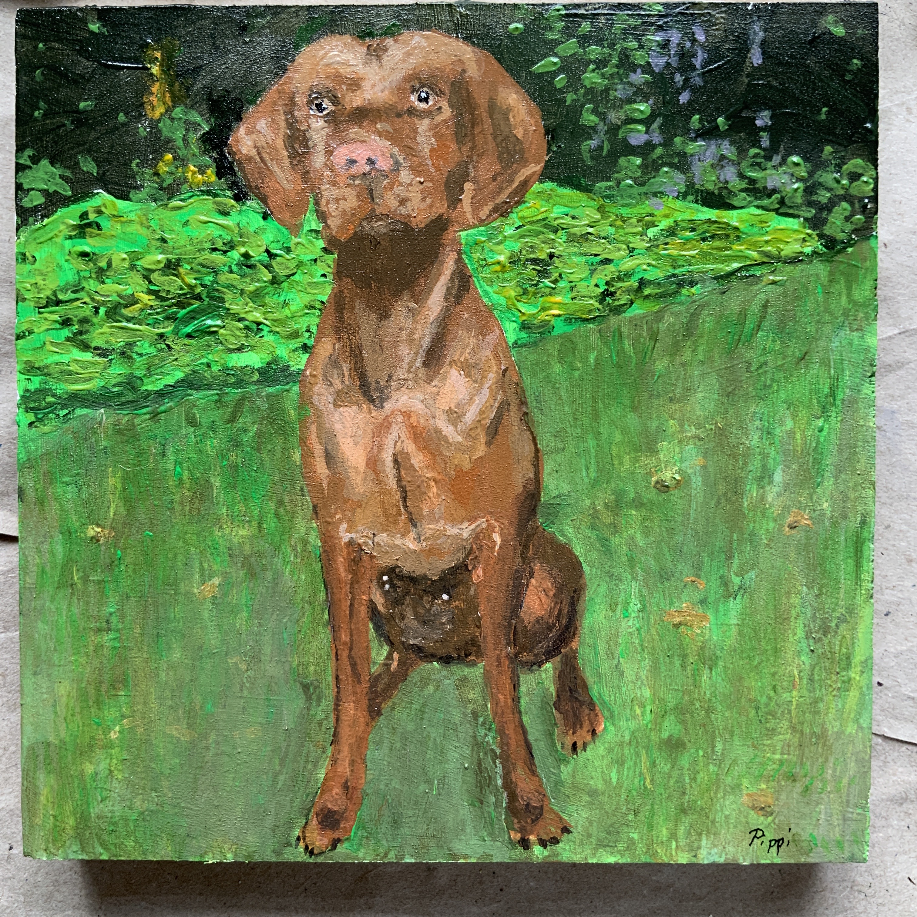
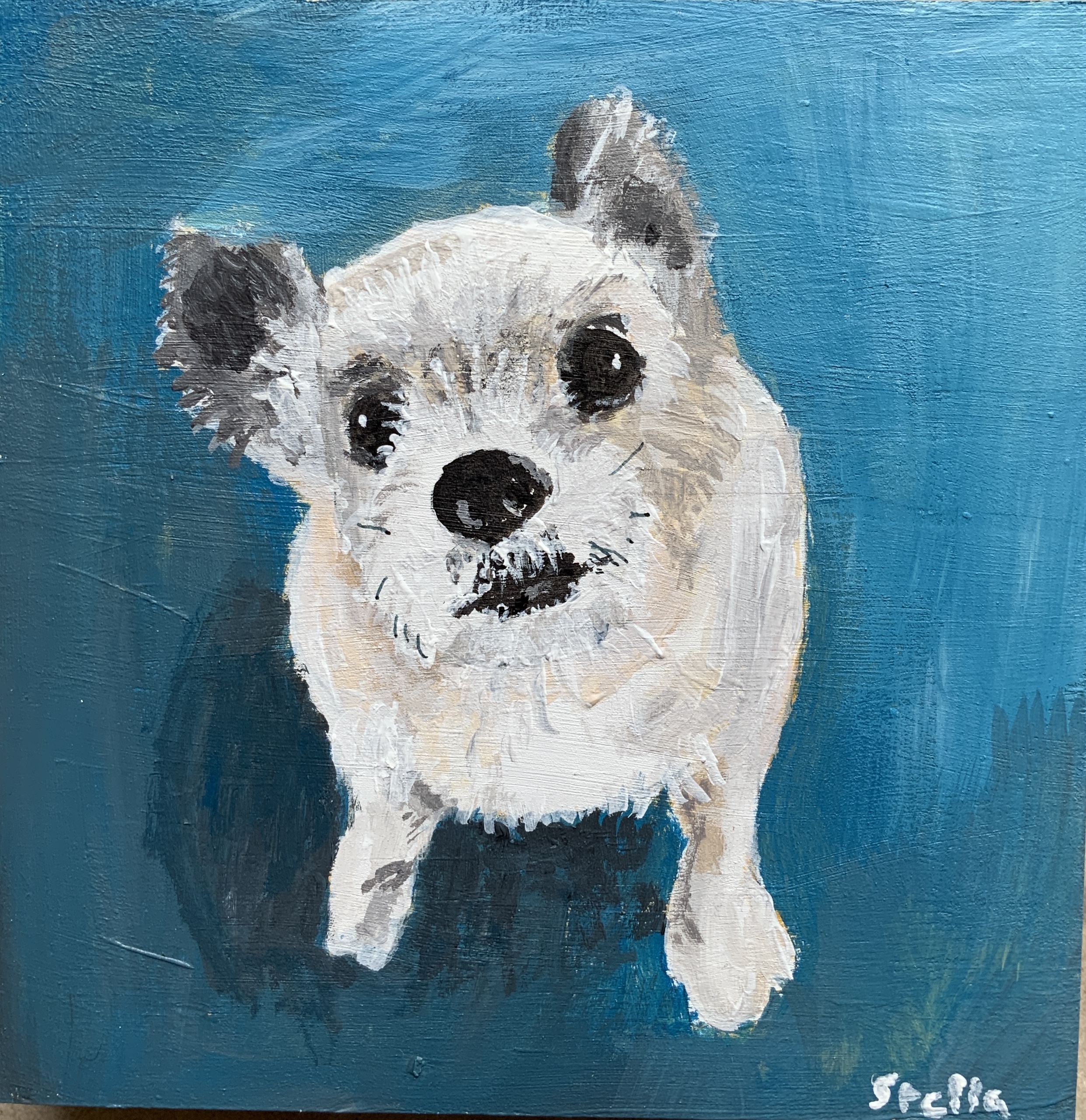
I forgot to post my recent picture of Pippi…

This is based on a photograph, from which I made an outline drawing that I transferred to a wood block prepared with gesso, and then had at it with the acrylics. Here are the photo and drawing for comparison…